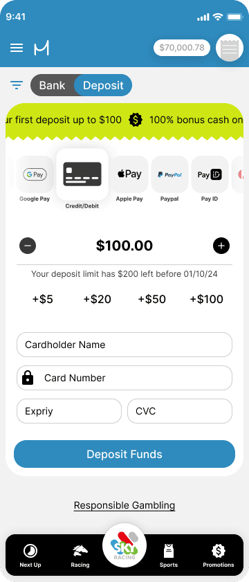
Improved Deposit Experience
As part of our design team’s strategic initiative, we identified the deposit page as a pivotal pain point within the application. Acknowledging its importance to the business operations, I lead a project aimed at maximizing the user experience. The initial deposit screen suffered from a cumbersome user journey, marked by an overabundance of clicks to execute basic tasks. In response to this challenge, my objective was to overhaul the interface, ensuring a smooth interaction. Leveraging gamification principles, the redesigned experience not only streamlined the process but also fostered increased user engagement.
The Payment Carousel
My initial focus was on developing a payment carousel to replace the dropdown field. This adjustment reduced the number of clicks required to change payment methods, from two to just one. Additionally, the carousel served as a visually engaging tool, enabling users to easily view all available payment methods without navigating to another aera.
The Deposit Widget
My focus then shifted to the development of a deposit amount widget, intending to gamify the application and provide users with various methods to input their deposit amounts. Collaborating closely with the Product Owner, we strategized to align quick deposit options with our promotional deposit match offers. Additionally, we incorporated intuitive plus and minus icons, enabling users to effortlessly add or subtract small increments with a simple tap, eliminating the need for manual retyping.
The Final Product
Improved user experience with streamlined deposit processes.
Faster deposit processes directly correlate with increased profitability for the business.
A smoother UI lends an air of legitimacy to both the business and its products, leading to trust and credibility among users.
